Tuesday, October 20, 2020

CRITIQUE SUMMARY — Wk 11 Studio Session

14/10/2020

Discussing documentation with Andrew

  • Everything doesn't need to be in it! Remember what Anne said back in Wk 1, that this will probably be bigger than a 1 year exploration, in a honours project.
     
    • Documentation can either: work around a finished outcome that is completely playable, or is the thing that gets people to understand the concept, research, design processes and show a user journey around these spaces. 

      If the latter, polish up what you can in the website, and leave it. Document it as a final piece e.g. screenrecord and embed into documentation

    • Experiments from semester 1 would be really good to put in, gives more context, sense and scope of this concept-world. And in different ways than you've focused on this semester. Also contextualises your work as a series of experiments, that don't necessarily have to be totally polished, playable experiences — especially the theatre. More about the world itself — as spaces to explore, move through, get lost in, be immersed. 

      Experiments that place you in the role of the performer, observer, voyeur. And think about the audience in those different roles, how their identity and lived experience comes into their reading of it, their knowledge/familiarity with these contexts and cultural references. 'Is the viewer important or is it more about the position you put them in, and their relationship to this space and the questions they ask about it?' Which doesn't need to be answered fully, or at all, but definitely something to talk to. 

      It is a playful and experimental space — trying to speculate around the boundaries / definitions / experience of identity. Something that we have lost the ability/freedom to do a bit, in our modern capitalist society ??? !? ! And everything here is looking at breaking from this rigidity. 

    • Website form — keep it simple, should be something you continue to work with and on after honours. Templates are great! 

    • Audience — going into industry, but with that academic grounding. Do a hybrid to show design, research and conceptual skills. Showing: contextual framework, material experiments and experiment outcomes, and demonstrate the trajectory through this. 

      Showing your trajectory through complex questions, around identity, with process and experiments as a response to these questions? 


    • Also a matter now of curating this trajectory. What's in and what's OUT!

    • Documenting research: yes. Polish it out of your dissertation. You do need this textual communication of the theory and ideas, can't communicate that purely through image. 
  • Project feedback — tutorial aspect:
    • Something like holding your hands up is about the least intuitive thing to do to a computer, could do this with pop ups and explainers, or have a separate scene as a guide into the interactions/rules/world

      Hands interaction — instruction should be fairly explicit. Don't need to tell them what will happen, but yes, like 'put your hands up' 
CRITIQUE
  • I guess I've figured out a form! RIP zine :( but honestly why give myself more to worry about. 

  • I think I need to map this out first. Go through what I've done this year, gather up the research and experiments and get a sense of this trajectory. Get a sense of how much I need to do. How to communicate the tone, materiality of the project. How I can make this project SING, be SHAREABLE, be MEMEABLE. How the research context can be communicated and structured. How everything can be structured. What bits of copy I need to have. And then how that might sit within a website format. 

    Then I have a better sense of how to use my time, and what bits of the theatre I can polish/when I need to do it to have the screen recordings for documentation. 

Wednesday, October 14, 2020

CRITIQUE SUMMARY — Wk 10 Presentation

 7/10/2020

Task 2 

  • Setup / context: 
    • Cyborgs and witches as performative 'other' figures/bodies. 
    • The stage/theatre as a space for the body, and imagination of these intersecting possibilities
    • Pitched performative website back in task 1, main shift is in the role of the user, now as the performer
    • Materialising my own intersection through code / spoken word / speech recognition / machine learning poetry / motion tracking
  • Talk through, process
    • Project as an exploration of this theatre metaphor. Setup as opportunity to ritualise and introduce the experience, and place it in this code-as-theatre context
    • Spoken word — collective power, prophetic narrative voice / guide. Macbeth tradition of witch-speak and the theatre 
    • 3D as a space to explore the dimensionality of the theatre as space, and similarly, identity. Shift in perspective
    • Stage as visual device, mechanism
    • Poetry stage: speech recognition/cyborg love poems in materialising intersection
    • Opera stage: gesture and desire, coded orchid-gestures in Chinese Opera + motion tracking = interactive opera
    • Intersectional possibility — should I be more explicit in naming and pointing to identities outside of my own? 
    • Feedback: wanted to get overall sense of project, too focused on details myself. But I feel like I know what I need to do, just not sure about time/how to prioritise. Similarly, how might I start pulling together the documentation.
  • My evaluation
    • I approached this presentation almost as a first pass at the documentation side of things, telling the story, going through some of the process. I don't know if that was totally accurate to the purpose of it but I think it was helpful to me. 
    • I think even the design of the slides, in the context section, could be something to bring into / develop further as a visual language for the documentation. I think it sets the ideas of intersections, dimensions / space and possibility up well, and nods nicely to the visual language within the project. 
    • Doing the presentation helped to bring the themes and narrative forward e.g. this project is essentially testing and experimenting with the idea of a theatre, giving a structure to the process and content
    • I think what I asked for feedback on was not super well directed and clear, but again, I think I have a sense of what is missing, just not where they sit in overall significance. The question about the broader intersectional possibilities I think was good to put out, so I don't keep questioning it and being unsure about it. I think it also was a way to test my framing of intersectionality, which I did get excellent feedback on. 

Ali:

  • Documentation will be important
  • Screen-recording — UNCLEAR: what is preset and what is determined by the user? 
    • The interactions themselves need more setup — some kind of tutorial element, example of what to do? How to get user to sit with the interactions and spend time with the ideas/content? 
    • e.g. This is the gesture space, model/tutorial it. 
    • The fake code in the entry is a good framework, maybe bring that in to each interaction? so it's more direct.
  • Stage — the metaphor of the user (through the webcam feed) as the actor/performer is not completely there. They're not positioned on the stage, but as a part of the wall...? What is the stage for — the user and their "body"?, or the output of the performance. How might you position the webcam differently to set this up more clearly. Or shift how you're framing the idea of the stage/theatre. 
    • As part of the stage — takes on a fluidity/threshold status? ? 
    • Be strict and consistent with this metaphor. The storytelling + metaphor is setting up so much of the meaning, think of it as the rules of this world. 
    • Isometric working well
  • Documentation: 
    • Catergorising your findings (e.g. designing for digital materiality, personal identity, etc) will help, give yourself a structure to work within. 
    • Andrew — will be a bit more text based, to contextualise research
  • Intersectional framing/setup
    • Listing, naming, labeling, separating --> conveying identity as something that is more formulaic?? And can be pulled apart and dissected, instead of complex and more dimensional. Especially on a surface level and without context. 
    • Andrew — Important to speak from your own position and not for others. (yes absolutely !!!!) Also just speaking from your own position opens up the space for other people. 
  • Project aims/tone: 
    • And the performativity you're speaking to is so much about ambiguity, the doing and being of a person in a very particular way. Attaching, locking in these descriptors doesn't allow for that fluidity. 

      But also recognising that sense of possibility I'm trying to point to may not be as apparent otherwise.. 
CRITIQUE
  • The points about the metaphor/stage are really interesting. If I am saying that the stage is for the output/result/materialisation of the performance, then is that output a sort of stand in for the body? Are you entering into this space where the body itself is reimagined not in terms of a body but what it performs? What are the implications of this? Stage is for embodiment? ?? Rather than the body itself. 

    I think that's what Ali was getting at when suggesting the webcam screen should go behind the stage / be really deliberate about the positioning. That way the presence of the user is less clearly defined as the webcam, and there is more emphasis on the actions and interactions.

    I'm not completely sure if that is my intention, I just think that visually and interaction-wise, it makes sense for the user-as-a-virtual-2D-plane to not be on the stage. Because that limits the interaction — you're not just watching yourself. It's not performance for the sake of performance. The speaking, the gestures are a way of embodying your own being, and the interactions materialise the possibilities of that. Possibilities outside of societal norms and what we're familiar with. 

    OR if you look at it another way, the premise of the interaction itself is an invitation to occupy this space, and in this context, this intersection. Occupy as in enact your agency and presence within the theatre. And the fact that it's performative situates the user even more within their body/identity, to literally occupy them. The "stages", these interactions that play with voice and gesture, are almost experiments to imagine / expand / materialise the richness and possibility? stories? experiences? that sit within these intersections. That are made possible because of them? 

    So then the stage is for this possibility. Almost as a device/metaphor to realise it, to will/speak/make it into being, through the being, embodying of your intersections. The theatre is for performing possibility. I think that sits well with the idea of the theatre as a space for imagining, and imagining through bodies. 

    So then, does it make sense for the user-webcam to be a part of the walls? The stage itself? I think in terms of the context/scene-setting of the stage screens, sure. To have the user sitting in the same space as essentially, the machine learning, or the opera context. They are of these intersections/substances. These entities/ideas/processes that hold their own layers of references and cultural context. 

    From the user's perspective, how does that read? To be part of the stage? Literally the wall... I think there is a disconnect there? If you're invited, and asked to take on the role of the cyborg-witch, and there's going to be a stage for you, you would assume you would be on the stage. Like if this is the 'Cyborg Witch Theatre', then you expect to see cyborg witches performing? But I think there is a cyborg witch performativity that is not as tied to the body. It's sort of a more detached speech/gesture, as a process of being and occupying. I think framing the theatre as a space for this process is important. Because the aim is not to realise a Performance. It's to get a sense of this process, of what it means and how it feels to perform your intersection, and grasp these possibilities. A 'cyborg-witch becoming', that in/ex-ternalises these possibilities? I think it's important that the body is not the thing being transformed and cyborg-witchified, it's your be-ing (not as a what, but a how). How you occupy the theatre and your body and your intersection to tap into, connect with, materialise these stories and these possibilities.

    I think in summary, I need to reframe the idea of the body to more of an embodied be-ing. Then the stage is for this process, a space to reimagine worlds to serve our intersections. (???) Still don't know what this means for the placement of the webcam. Diagram it out.
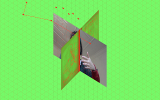
  • User/webcam as part of the structure. 
    • Takes on a threshold status???? As in you're not on or off the stage, but part of it
    • Stage as a threshold device????? 
    • Stage as container for the interaction, cyborg-witch becoming..,? 
    • I think it's specifically that there is a sort of window that the webcam screen pops into. That lets you see through the screen/stage and again, understand this stage as constructed. And when you, the user, fills that space, sealing the wall, acting as this inbetween element, what does that mean? 
  • The theatre is a space for reimagining, and reimagining through performativity as a process for becoming. Reimagining through occupying your identity through a cyborg witch performance, through voice and gesture and interactivity. This is a performativity for resistance. That asks you to embody and occupy your identity. So, resistance itself is performative, and embodied. 

    I think it's also worthwhile to acknowledge the processes involved in the interactions (the code, motion tracking, speech recognition, machine learning) as performative themselves. As processes themselves that are in flux, responding and feeding back to their context and environment. So in a way, are the stage walls a way to reference all these processes, including the performative being of the user. A way to bring in all these 'actor/actants', not onto the stage per se, but into the space and interaction.  

    The stage is a more explicit construction, a spatialised arena for these processes to come together and materialise in relation to each other. 
  • Documentation. I think it would be really useful to think through how I might structure this, into findings like Ali suggested. Especially for tomorrow's session. I think doing this will also help to do some of the reframing in a way that is more useful and directed. (And also, I need a mini essay! ok.)

  • Identity / intersectionality. 
    • I think it was really interesting to hear Ali's take and reading of intersectionality, and also how that's coming through in my project. The use of words like fluidity and ambiguity are not ones that I've really used myself, or really consciously tried to embody in this project. So it surprised me, but I do see it. I see it in the intermingling and conversations that are happening between the queer context and the cultural context, and the combined materiality of the interactions and the space. 

      And the speaking of, the labelling and declaring of my identity in this particular way, that defines my gender/race/sexuality, is not something I feel totally comfortable in. In some way, I thought that directness and explicit speaking of, was something that I was expected to do? And necessary in defining this space. But also I do want to claim the specificity and power that can come with this naming, and identifying with. And I think that's all ok, these feelings can sit alongside each other. But when it came to materialising that, beyond the words themselves, it does become more ambiguous. I think I was so concerned about whether or not the content would be read as queer, or Chinese, or feminist, etc., and the representation rather than the embodying of. 

      And I was very fixated on the intersecting and how to materialise this possibility of that action. But I guess what Ali picked up on, that is there in the project is the fluidity of lived experience. And the dimensionality of the intersection, as a space that you occupy and move through. I think really consciously shifting into this idea of dimensionality feels richer and more complex. And truer to my aims. It centres it back on my experience, and possibilities within that, rather than a surface level, formulaic, hypothetical (from my singular perspective and research so far) possibility of other identities. And I think it is more reflective of the stages and interactions, the real body of the project. 

      The 'dimensionality of lived experience' is a phrase I've articulated a lot since Wednesday, and I really like it. I think it expresses the richness and yes, possibility of identity in a way that is simpler, more approachable, and just more open and less academic jargon-y? 

  • Tutorial suggestion — modelling the interaction. 
    • I really like this suggestion and can't believe it never occurred to me! I think the general feedback to get users to spend more time in the space, and acclimate them more to the rules/conventions/functions of the "world" is a really crucial one. I think it's the overall narrative and ...paratextual grounding? that I haven't been able to assess very well myself. 

      In terms of actioning this feedback though, I'm not sure exactly how... especially if it's more of a traditional tutorial? Like for the opera stage, how would I model that. I can see it being done with the poetry stage with a voice recording.

      From 14/10 studio session: maybe it's about having more of the speech bubble-esque pop ups and overlays. Like a walk through of an interactive experience. 


Sunday, September 27, 2020

WK 9 ACTION LIST

 ACTION LIST

Today (Monday 28 September)

For feedback on Wednesday

Tuesday to do. 


Hands stage —

  • Nail down interaction and narrative
  • Thumbnail narrative
  • Thumbnail imagery
  • Do hands illustrations
    • Print
    • Draw
    • Scan
  • Typeset and layout hand stage
  • Code interaction
  • Code sound effects
  • Change to screens format
    • Float in screens
    • Section out webcam and hands


General —

  • Colour — test for colour blindness, general colour palette refine
  • Think through intersection.declare
  • Spoken word — editing effects
  • More sound effects, building atmosphere. 
    • Find/edit
    • Code in
  • Thumbnail and code additional type elements — e.g. enter stage 2
  • Audience — cultural references for a diasporic audience. 


Invitation — 

  • Refine interaction — 
    • fade, 
    • what happens when
    • Transition
    • Sound effects
  • Intersection.declare (be clearer about your position? 


Poetry stage —

  • Microphone input waveform? Reader?
  • Making the spoken text additive
  • Adding all the poems
  • Illustrations
    • Thumbnails, sketches
    • Illustrating 
  • Float out screens
  • Stage 2 button/transition


Troubleshooting —

  • Wait to hear back from Andrew
  • Test translating images separately, clipping plane
  • Resizing window — adapt for WEBGL, ortho
  • createInput text box


Presentation —

  • Gather process
  • Slides
  • Think about framing and communication


Questions — 

  • do we have a reference list — using resources
  • presentation… how should we think about it
  • Project — final design outcome (?)

Tuesday, September 22, 2020

CRITIQUE SUMMARY — WK 8 Studio Session

GENERAL FEEDBACK:

  • Think about what you're presenting in Wk10 — is it a final design outcome? Is it a set of experiments? Put boundaries and definitions around it so they know how to contextualise the project and what to give feedback to.
  • Be strategic in what you put your time to in these next two weeks. 

CRITIQUE:

Andrew:

  • Window resizing/clipping plane — it's being weird(? not transparent so shouldn't be an issue) Look further into the windowResizing function in javascript. Send over code. 

    Same with the create input text box, hard to know what's going on without seeing the code. Might have to hide it? 

  • Don't prioritise the troubleshooting — get the interaction and experience working as best as you can first. Can specify that the optimal size is the dimensions of my comp, etc. 
  • Visual style is working well. Bringing in the type has helped. 
  • Should test the readability/accessibility of the colours — run through a colourblindness app. 
  • Linking to another page — window.load, window.open, triggered by an object / time / event
  • Retrieving the username — pass variables between windows of the browser. Can do by accessing/calling local storage? 
  • Illustrations for poetry page. Are they going to be glitchy and pixelated like the cloud image or referencing more traditional print? Tying the poems into the imagery/type really starts to gives the whole thing/setup/stage more purpose, contextual relevance. 
  • The floating screens working well to construct the stage, same with the speech and sound effect — visceral but virtual. Speed — could slow loop of draw to make it smoother for slower computers. But a lot of it is dependent on external factors like (what else is running in the browser, computer specs, etc.)

Adrian:
  • Visual style working well, the "clues" are working to give you information about the experience / what you're supposed to do within it. Working as it's own kind of worldbuilding. 
  • It might work better to have the transition into the first stage as an automatic load, and stage 1 to 2 as a manual button/click. 
  • Hands interaction — Think super simple. Might work better to make the variables controlled by the hands additive, so the movement/progress is not determined by how jumpy as it actually is. That it can't go backwards. 

CRITIQUE OF CRITIQUE
  • Hands interaction — think Adrian's suggestion of controlling the interaction/movement in one direction is really helpful, helps me direct the potential concept and interaction in a workable way. 
  • Will definitely test the colours for accessibility — need to go back and reevaluate them regardless. 
  • Illustrations for poetry page — I think this would be really cool. The potential to bring in glitches and more of a digital materiality is also really cool. Gifs I will definitely look into if I have time. 
ACTION LIST 
  • Priority items — Getting the hands stage to the same place. Giving it narrative significance (!!!!) and purpose. Coding this. Making the image screens for it. 
    Linking the experience together. 
    Working the whole experience together — sound, more atmosphere, getting the voices right, type elements. 
    Illustrations for the poems. 
  • The hands stage is definitely the priority at this point. Go back to thumbnailing and concept drawing to work it out. 
  • Other priority till Friday is to link the webpages together so that you can bring any problems to Will. And comment your code properly, zip up and send to Andrew. 
  • Do I need an endpage? 
  • Start thinking about the presentation and how you might construct and tell the story of the project(?). 

Wednesday, September 9, 2020

EXPERIMENTATION LOG — userNames, invitation build

 Aim

To get a text/username input working, and feeding into the fake code. 
Build animation/interactivity into the setup — grid, stage. 
Fix the sound issues. 

Precedents / context

Wk 6 studio feedback on usernames, and how I might build it into the experience. 


Process / methods


  • The priority was the sound. I was watching videos and making sure I had the code right, but it got to a point where sometimes it worked and sometimes it really wouldn't. Thought I would just upload to github and test it. Doesn't work very well in chrome, works perfect in firefox. 


  • Researched the different options for text input — keyPressed(), createInput(), etc. KeyPressed() didn't seem to be able to store information that easily, and I didn't know how I might tell users to engage in that way. CreateInput() makes one of those standard web text boxes, so there's an immediate familiarity with what you're being asked to do. 


  • Finally started coding the setting up of the physical theatre, still with a lot more to do. Ran the code out of the screen, and faded in the grid. 


Reflection on action

  • The sound/browser issues were frustrating, especially given the agony spent over it, but it's good to know that my code was fine most of the time. It's weird with firefox though— the fullscreen doesn't full screen, so you have to scroll to get to the bottom. The colours are like SUPER rgb, which is quite a shock honestly. 
  • Regarding how I would go about setting the username, I think leaving it completely up to the user was the easiest, most streamlined and organic option. Random generating from a set of words I determined seemed rather unnecessary and awkward within the setup/invitation space? Felt like it could be rather drawn out, or otherwise miss a step or two from the user's point of view. 
  • The username/text input came with a bit of a learning curve and I wasn't sure if I would be able to execute it, but it seems to work. Was happy that I could get it to write in the fake code e.g. (username input).body(engage);, and start working it in to other parts of the experience. Still unsure if I can retrieve it from another file/sketch once it's all online? 

    Still questions around how the user progresses through the screens — the username screen is progressed by the 'enter' key, as part of the input, but that's not foolproof. And is it then weird to switch back to clicking the mouse?
  • Also last week I had planned to record the speech for the fake code but now I'm not too sure – will it make the whole setup too long? Does it make it tedious to have to go through all the audio clips to get to the later interactions? 
  • I like the big 'Cyborg Witch Theatre' at the start. Was thinking about Nicky's comments on type and scale, so I think it's a much needed visual element that's also a good conceptual cue for what the site is. I don't know if the placement could be better? Especially with where the comments start to hang from. 

Reflection for action

  • Get help from Will around browsers and linking pages together on Github, and accesing the text input from another page. Also user testing with some other people, and doing some research/troubleshooting into what the specific problems are. 
  • Look into another sound element (background/white noise/reverb) instead of speaking the fake code. 
  • Streamline the setting of the stage — work out how to move the text box out !!! And when to stop one sketch and start another. 

EXPERIMENTATION LOG — Motion tracking, hand objects

Aim

Experiment with poseNet, how I might map it to the ortho() perspective, how I could bring in objects and play with the input of a body. 

Bring in visual references — acupuncture charts, fingernail guards. 

Precedents / context


Feedback from Andrew to experiment with poseNet, body/gesture. 


Process / methods

  • Imported the ml5 library in and poseNet. 
  • Got poseNet code off an example online, by Kyle McDonald: https://editor.p5js.org/kylemcdonald/sketches/H1OoUd9h7
  • First task was to get it working in the 3D, ortho() perspective because that's the space of the theatre. At first I was using quite a bit of rotate which i think made things unnecessarily complicated. 
  • Loaded a hand model with the objective to track it to your wrist points. 


  • Got the keypoints and skeleton situated in 3D and ortho()
  • Imported in the scan of the acupunture chart as a possible image element/texture for the object. 


  • Maybe I could do visual experimentation around these visuals — illustration, collage, photoshop
  • Just tried using it as a texture for the vases — which looks kind of cool but does not show/allude to the content in any way. 
  • Not sure if I like the vases? They're a nice framing device, and an interesting alternative to a very literal stage setup like I have already but it doesn't feel intentional enough. 


  • Still had keypoints/skeleton up but realised I couldn't attach objects to keypoints (or can I???? Try making the translate values keypoint varia) so tried mapping the x and y coordinates of the wrists to the colour/light values. 


  • Feel like I can do a lot more experimentation with type, had a quick go at making those paper squares that say 'FĆŗ' ē¦, or good fortune. 


Reflection on action

  • I think the scale of the hands is effective visually, you almost feel as though you're being hugged or embraced by them. The colour mapping is cool. I think it looks good but is perhaps not that interesting? It needs to tie in to the concept better. 

  • Am really pleased that I got the motion tracking to work in 3D and ortho(), although I suspect I was making it much harder for myself at first with the rotate? 

    However I don't feel like I'm making the most of the motion interaction. The imagined plan was to track the different points of the hand, so it could be a lot more gestural, but poseNet has only been trained on key joints, so hand/arm-wise I'd have the wrists, elbows and shoulders to work with. 

    I know it does the whole body, and from my testing it seems to work really well, but as a website you access through a computer device (laptops and desktops), limiting the scope to the chest up and arms seems like the best choice.  
  • The Vase and type/good fortune character don't feel intentional and authentic enough. It feels like a surface-level, rudimentary attempt to make something Chinese. Same with the gradient/light changing material of the hands. It feels too obviously queer, without getting to the heart of the experience of queerness. Like, oh, of course, rainbow, gradients. That's almost too easy. 

    I think what worked so well with the poetry translations is that they feel really personal and thought through, and they were specific. As a cultural "object", they were structurally and tonally different from traditional western poetry. It just has more depth, so that the representation feels more earned and materialised in a way that it not always is. 

    I just feel like I need to go deeper into the experience of this intersection — what it feels and means to live it and be it. How it actually affords me possibilities and enriches my perspective/experience of the world? How that might have come from a place of shame/pain but be reframed and reclaimed. I need to earn reclaiming. It comes with a process and reflection/iteration. 
  • The different objects and looser layout/setup of this stage makes me think of flashgame environments? Particularly with the ortho() perspective. It could be really fun to play with this idea and the playfulness of a theatre environment with props (other google poly models that I've seen around — teapots, bamboo stalks, type/characters, costumes? Pick things up, interact with them, move through the stage... 

Reflection for action

  • I think I absolutely need to sketch and work through different possibilities. 
  • Put it to the slack group again — more gestural movements. 
  • Still feel like there's a lot more to be explored with typography and image making. I think that's a good thing to get stuck into during stuvac / the next two weeks. A different kind of making to all the coding. 

References


https://editor.p5js.org/kylemcdonald/sketches/H1OoUd9h7

https://poly.google.com/view/fLzSqhcYmKg

Thursday, September 3, 2020

CRITIQUE SUMMARY — Wk 6 Studio Session

2/09/2020 — Group Studio

Setup pseudo code
First motion tracking exp
Visual style refining
Cyborg-witch sound experimentation

Critique

  • Motion tracking — acupuncture reference interesting, could play with energy-cyborg electricity/circuitry parallels. E.g. change the form/image based on which side of the screen you're on etc. Playing with the intersection through the visuals and visual/conceptual references.

    Loading textures onto the models, like wrapping paper. Good place to start, works with established aesthetic e.g. loading transparent images etc. 

    Play with props — can save out google poly models as obj files. 
  • Voices  working well, the cyborg-digital, Macbeth witches, female voice elements are all coming through and are balanced. 
  • Code stuff — inviting interaction — from setup — flashing cursor, or something else. Webcam — try making a first screen where the webcam is called and ready to go, so you don't get the delay. 

    Images cutoff — look into the clipping plane on camera, might also be the transparency on top of each other? 

    Type glitch — not certain what's causing it. Send through code file. 

    Sound — try switches and booleans instead of current time? Also try different browsers for current time. 
  • Username — If you build it in (spoken/text), use it throughout the experience. Refer to the user as such. Good way to bring people further into the experience/world. 

    Adrian — likes the idea of usernames. Create your own? Random generate a combination from a list of words. Agency of the user — creating their own, or being "assigned" one. Giving a name, and true names, hold power and a lot of significance, especially in different cultures and spiritual circles. What are you playing with here and how might it inform the experience/discourse around intersections. Definitely makes the experience more personalised, and allows you to more fully occupy the space. 

    True Names — cyberpunk novella by Vernor Vinge. Keeping your true name hidden in cyberspace. Have a look at it. 
  • Fonts — trickster maybe too much. Droulers is working well!
  • Visuals — type legibility is not great, experiment with the colours and contrast. 
  • Speech (bubble) — Working better than the banner, more visible. Harks back to 90s chat sites and interfaces e.g. The Palace. Could be a combination — different types of information could be brought in through the speech bubble, or the running banners. 
  • Audience — 2 audiences — primary target audience of project and audience of the documentation. The 2nd will consider the first audience, and assume that perspective when looking at the work. 

    Andrew — understood my project audience to be people with an understanding of and personal identification with intersectionality — women and gender diverse folx, people of colour, LGBTQ+ people, and combinations of these identities, who I am inviting into this space. The audience from the documentation perspective would be those looking at my portfolio, in the design research space, etc. Perceived that I was never sure if I was going to open it up to a wider audience? It is hard to navigate and make sense of these multiple audiences, that's normal.

    Can maintain that the output isn't for a general audience, but one that you're defining. Then think through how you're defining your target audience to the general audience of the project as a piece / process of design. 

    Adrian — framing the experience with an invitation to start off with is a good way to approach it. The username idea is a good way to open it up even further, as a playful, accessible touchpoint to the world that you're about to enter. Imagines that some people might be uncomfortable and uncertain about the subject matter / in the space, and that is a fun way in. Also opportunities to define these intersections further(?) — incorporate Chinese characters/astrology references, etc. as added elements of representation. 

Critique of Critique

  • SO much to unpack here, think on, work through. Audience first. This is really helpful. Andrew's comments are making it more clear while also making me feel better about struggling to define who this is for, who I want it to be for. I think creating it for an intersectional audience, or those who have an understanding of it / identify with those identity groups, makes sense. When I think about it and try to remove the confusion, I am materialising an intersectional space (my own) and building performativity into it so that the process of reimagining and becoming is visible. So that possibilities and narratives outside of what has been established by white, male, heteronormative bodies are visible. I can see someone within that interacting with this space, but that's kind of not the point? 

    I think there's more power in people of intersectionality, those who embody intersectional perspectives, to have some (some more than others) representation and potentially, build upon this framework to explore this within themselves. The framework/process of cyborg-witch becoming can be transposed for anyone (and significantly, perhaps less potent), but the point is to capitalise on the inherent "deviance" of the cyborg and the witch, and "deviant" gender/race/sexuality — as a metaphor, as a generative strategy for a viral deviance, survival, reimagining. So why bother to speak to everyone? What's the point? 

    My main concern was more about what it meant for people outside those identities and communities to occupy space in a project that is exploring representation, through performativity, through inserting the audience into the project. And it's not like they're expressly choosing to do so. The project puts you in that position. While it helps to understand the distinction between the output's target audience and the audience of the documentation, and how the latter might try to experience it from the perspective of the former, the performative element blurs that. 

    I think this is where the usernames can be really helpful in stripping some of these layers back. Blurring those distinctions in a way that is playful and helpful? I'm not sure which route I would go with — self/random generated names, maybe I can find a way to test this.
  • On the motion tracking, I'm eager to get this underway. I like how Adrian was conceptualising the link between qi and electricity, acupuncture charts and circuitry. I think the acupuncture also taps into the idea of the witch as a healer, with knowledge of the body — ideas that are present across different cultures. Would be cool to explore this through 3D objects and texture mapping, or the linework like Navira suggested. I don't know if I'm super excited by this, but I think it's definitely worth testing. On texture mapping though, I'd be keen to get back to image-making for a bit to generate more material to work with/import in as the backdrops/play with on top of 3D objects. 

    Also not forgetting that the suggestion last week was to build the interaction around gesture. Which I think is really compelling, especially in a performative context, and with hands! Should look further into hand tracking projects and see if there's anything I can use. And also writing and thinking about gesture in a queer context. 

    I think the idea of props is really interesting. I hadn't thought about it, but there seem to be more possibilities — incense, teapots, vases, bamboo, etc. just having a look at what's there on google poly. 
  • I agree with Andrew on the speech bubble. I think it suits the experience and visuals, and is a fun kitsch element. I think doing some thumbnails and mapping would be helpful now? To start bringing in details like the speech bubble, and work out other bits of communication, how they're presented and how they are consistent throughout. Also good on another level to work through the code on paper. Start researching how you might link pages/files together 
  • Setup page — keep going with recording and editing the voice. Test the username input/generation in code. Test it as an experiment maybe? Build in the interaction please !!!!!!! !!
ACTION LIST
  • Get stuck into the motion tracking — understanding the code. Researching gesture, hand tracking, concept/references. (image making for 3D objects?)
  • Usernames — map out process. Develop method to test.
  • Make overview map of project — conceptual, thumbnail, audience/user. 
  • SO MUCH 2 DO !! :-)

    Wednesday, September 2, 2020

    EXPERIMENTATION LOG — Audio experimentation

    Aim

    Extend the setup into "code" to see the stage/theatre being built (hopefully in real time). 

    Be more explicit in what the audience's role is, setup the "performativity" earlier than the interaction. 


    Play with Adobe audition

    Layer the sound file in an interesting way, bring more cyborg elements into it. 


    Precedents / context


    Mixed-group critique from Friday — affording performance, inviting speech. 


    Previous experiments in recording/layering. 

    Macbeth witches — collective female power, omniscience. 


    Process / methods

    • I don't know if I always planned to do this, but started putting down the "actual" functions/commands that are called to build the theatre.
    • From feedback on Friday, and Andrew's feedback from a few weeks ago — framing the speech / functions as incantation, replacing 'function setup' with 'incantation setup', etc. makes sense, and builds on the cyborg-witch materiality.
    • I am imagining that as these functions are spoken / after they're all done, the commands materialise e.g. the perspective(gridPlane); is drawn in, and the stage.set(); allows the stage walls/images/backdrops to fall into place. I think this would give the theatre a real sense of place and also executes the premise of code as spell. Essentially giving it more movement and interaction so that it's not just static. 


    • I think the commands for the user are really clear, and take that step to position the audience within the experience. I especially like the acknowledgement of pronouns, I think that is a nice touch — I think it even works as is as an acknowledgement, it doesn't necessarily need to be filled in? The user.enter(softly) is I think another nice tonal touch. 

      From Mike's feedback on Monday, playing with usernames I think would really drive that home, and allow users to feel invited into and part of the experience. 


    • Adobe audition to record and edit. Previous used audacity, this seemed to allow for more variety. 

    • Used the effects-modulation-chorus function, 3 voices, played mostly with the delay time and rate, wet/dry sound, etc. 

    Reflection on action


    • I think extending the setup in this way is a good direction to move in. It creates a space to let the audience understand what their role is in the experience. And very clearly shows that the theatre is a constructed space, with intent and purpose, while bringing in the audience into the process of its construction. I think the code creates its own sort of ritual, especially when spoken — it is performed, with specific forms and syntax to adhere to. 

      But maybe the idea of performance, and the theatre as a space for that, is not as focal as it could be. Does the user need to be specified as the actor? The performer? (Adrian's feedback about how it's missing some of the context I give when actually talking about it.)

    • The "code" seems to be reading well — as per Adrian and Navira's feedback (both with experience in code, should test it more). Adrian also mentioned that as the intersection.declare(); is spoken, 'queer Chinese-Australian Woman' could type in like it is being inputted in real time. I think this is a good way to show that this has the potential to materialise and represent other intersections, but this project is working with mine. 

    • The audio experimentation went really well. I think the result is much richer and more effective. It introduces a cyborg element, and the witch voices are also built upon with the differences in pitch and tone. I really enjoy the readings that are more theatrical —the first stanza and 'cyborg witch becoming' — it's less cringey because I can't hear my voice as much, and I think it starts to layer tone and character into it. Also because they're not three separate tracks, it's all in sync which is great. 


    Reflection for action

    • Keep editing the words. Think about what's missing in the communication of context/concept. 
    • Lay down the audio for the setup/draw. 
    • Work out how to regulate the effects on the audio clips — fix up these first three. 
    • Test usernames — code, and execution. 
    • BUILD IN INTERACTION WITH STAGE

    Tuesday, September 1, 2020

    CRITIQUE SUMMARY — Wk 5 mixed group critique

     Mike

    • Narrative really strong, both cyborg-witch layers...textures are coming through. The speaking of the comment/poem is setting it up really well.
    • Didn't feel inclined to read the 'script' out, didn't realise that was the aim. How could you encourage this, invite that sense of performance and play?  
    • Representing intersections — reads queerness into the setup, not any references to Chinese culture. 

      Is this a space personal to you, that you want other people to experience?  
      • Yes, partly but also I want build a process of cyborg-witch becoming so that the audience feels more open to exploring/occupying different possibilities of their own body/identity, whatever that might look like for them.
      • Thinks I'm on the right track!

    Jacqueline Gothe

    • Might be a problem with bandwith? Device memory? — Not working, or is really slow to work on other people's computers. 
    • The webcam, seeing yourself there is really exciting, a motion capture based interaction on top of that would be very cool
    • Setup is working, communicating really well. The cyborg-witch materiality is definitely coming across. The play on words e.g. 'parse'/pass is super effective
    • Conceptually strong, keep it that way so that it contextualises the experiments seamlessly. 
    • Visually it is working, especially if you get the live feed to work. In terms of the stage setup, there's a bit of confusion. The imagery is in the right space content-wise, but it seems unresolved — the weird cutoffs at the corners, transparency of the shrine, the legibility of the ouija board etc.? Could be intentional but make sure it's your choice, not just throwaway details. Could play with the clarity and not-clarity of the imagery.... what the forms are? (??)
    • Visually evocative of the 60s — the forms... also 90s with early net art, and degradation of the image. 
    • Using 'incantation' deliberately, to frame speech, and thus, the speaker (user) as a witch, in this context? interesting approach..? Might be established first in the setup space — get them to speak along with it? Be more explicit in how you are constructing the user as a performer(?) in the theatre. 
    • The camera feed could be really key in affording speech — seeing yourself there

    Critique of critique
    • I think the cyborg-witch materiality, and ontology is really coming through, I was not concerned about that so much but it's good to see that the conceptual groundwork is really strong. 
    • The positive reaction to the webcam feed was surprising. I haven't thought that much about it, but I should be. How might I make it more embedded in the scene and look more deliberate?

      I think Jacqueline's points about the visual style are important to keep in mind. More research into theatre spaces and setups would be good here to, again, make sure these choices are deliberate. Also to work out why the images are getting cut off, and if I should fix that or work the imagery around it. To experiment and iterate, be a little looser with the "template"

    • Mike's questions about the space and the audience are really important, and I'm struggling to make sense of who this is for, who it isn't, and how I design to that. Who gets to play on the stage. I think the interactions are the most compelling aspect of this, being able to play and see yourself occupying / embodying a cyborg-witch way of being. But what does it mean when a white man (?) "stands" on that stage, and speaks those words? Because I can set out to make this for a really specific audience who occupy similar intersections to me, but other people are going to enter it, and realistically, more people who are not LGBT+/Chinese/Chinese-Australian/women are going to experience it than not. 

      Gender/race/sexual identity aside, I think it is for everyone who has access to the internet, and a webcam and microphone. I'm not acknowledging all identity categories e.g. able-bodiedness/disability but should I so that it's not ignored? 

      I don't know if this, as the audience is too broad? I don't know how to reconcile the differences in identity and representation, but then asking the audience/putting them in a position of occupying a space that isn't theirs. Doing a project about representation but having, potentially, other people occupying the space. 
    Action list:
    • iterate ways to get people to speak
    • user map the experience out
    • start thinking/researching visual styles/precedents to make sure the design is where you want it to be.